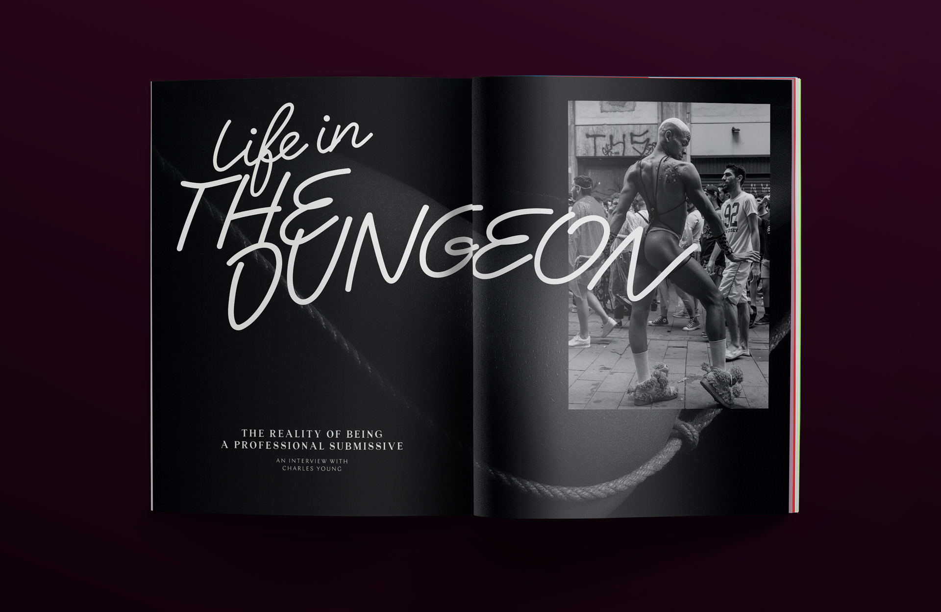
Of The Flesh is a BDSM & sex-forward blog that champions inclusivity and awareness. Started by intimacy coach Indygo Ann, the online publication features interviews with people within the BDSM communities, personal exposés as well as advocacy.
SIREN was approached to help define a brand and online experience unlike others within the space. The goal was to find the balance of edgy yet refined — making the brand more sophisticated and approachable while still embodying what makes this community so unique.
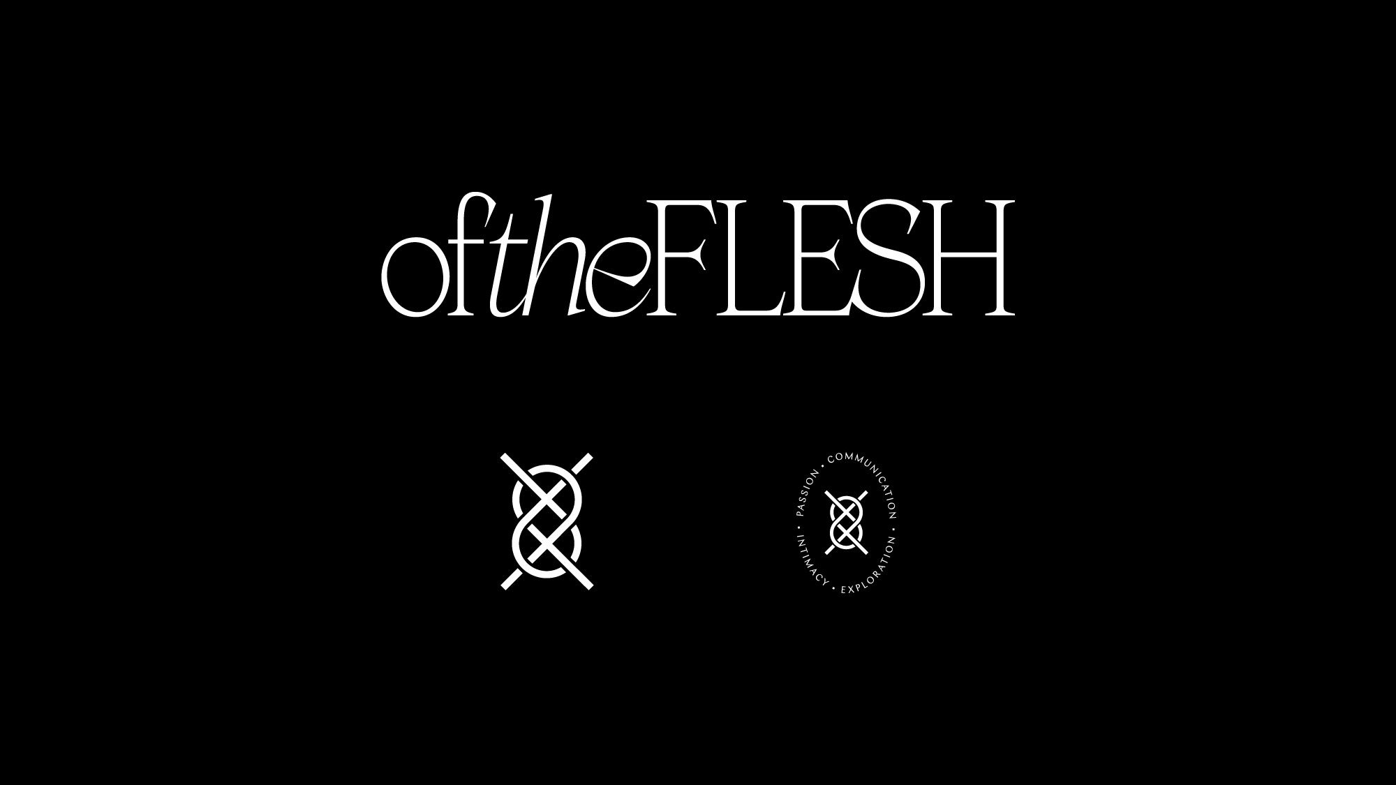
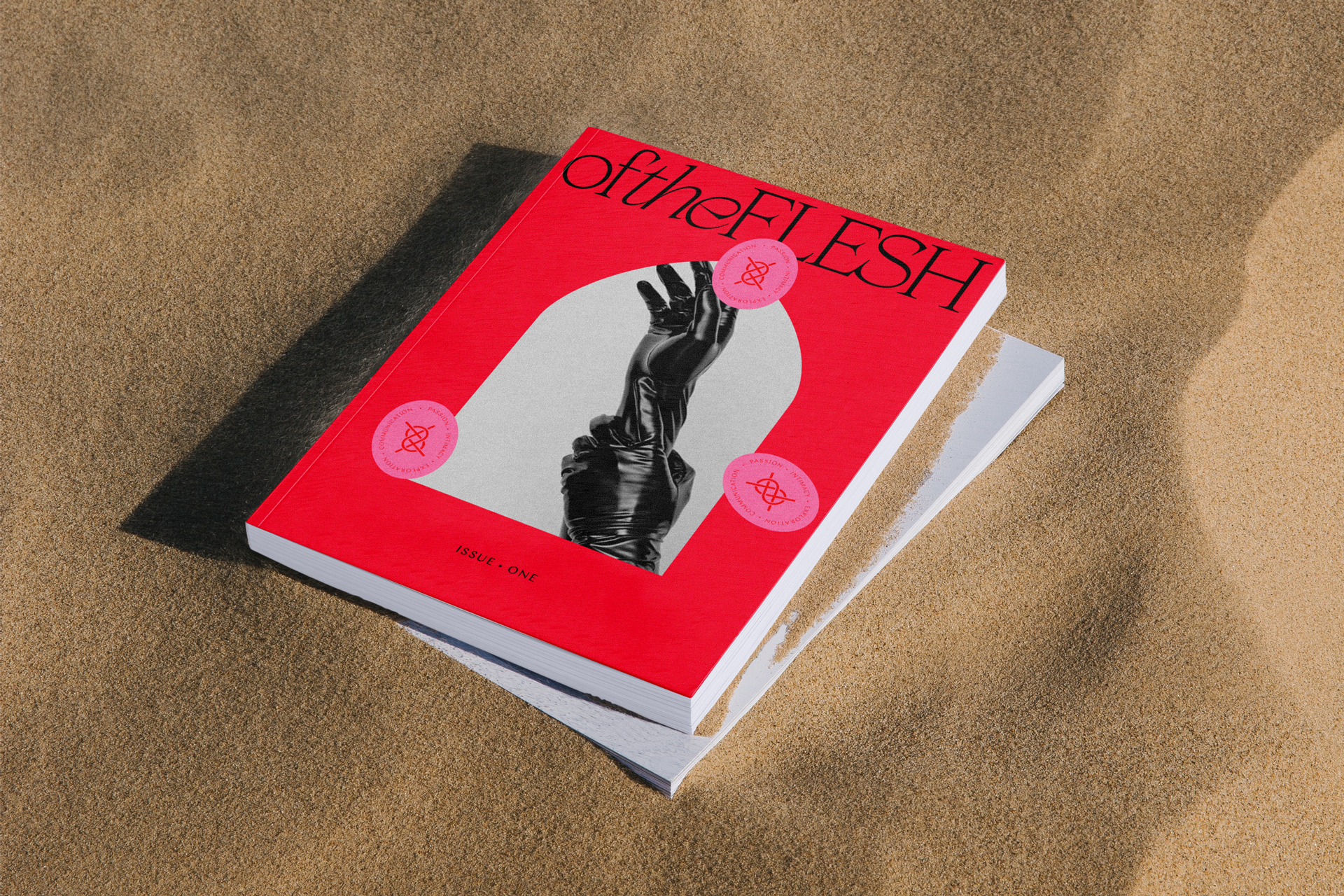
Our logo captures this balance within the letterforms — a modified version of the elegant serif typeface Apoc that feels at once beautiful yet dangerous. Paired with our wordmark is a symbol representative of the bond (and binding of course) inherent within the community.

We drew our inspiration from classical magazines and newspaper design vernacular to approach the identity with an air of sophisitcation (with a pinch of smut). We looked to well defined mastheads that captured the essence of a brand with beautiful typographic solutions.
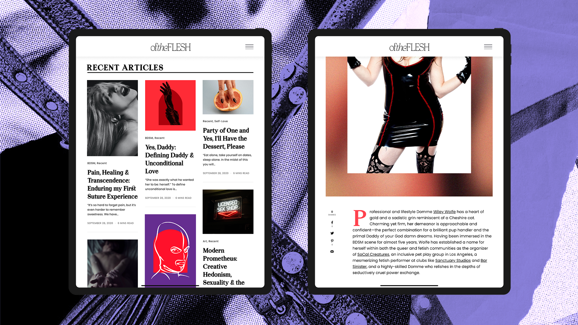
The web experience has been revamped to align with the GQ’s and Esquires of the online quarterly sphere — more culture magazine than smut publication — allowing for a more inclusive and approachable experience for newcomers.
GET IN TOUCH:
hello@sirensf.com