

Zipline approached SIREN for a holistic rebrand—a top-to-bottom retooling of all of their brand expressions that started with a new brand strategy—positioning them at the forefront of retail communications technology.
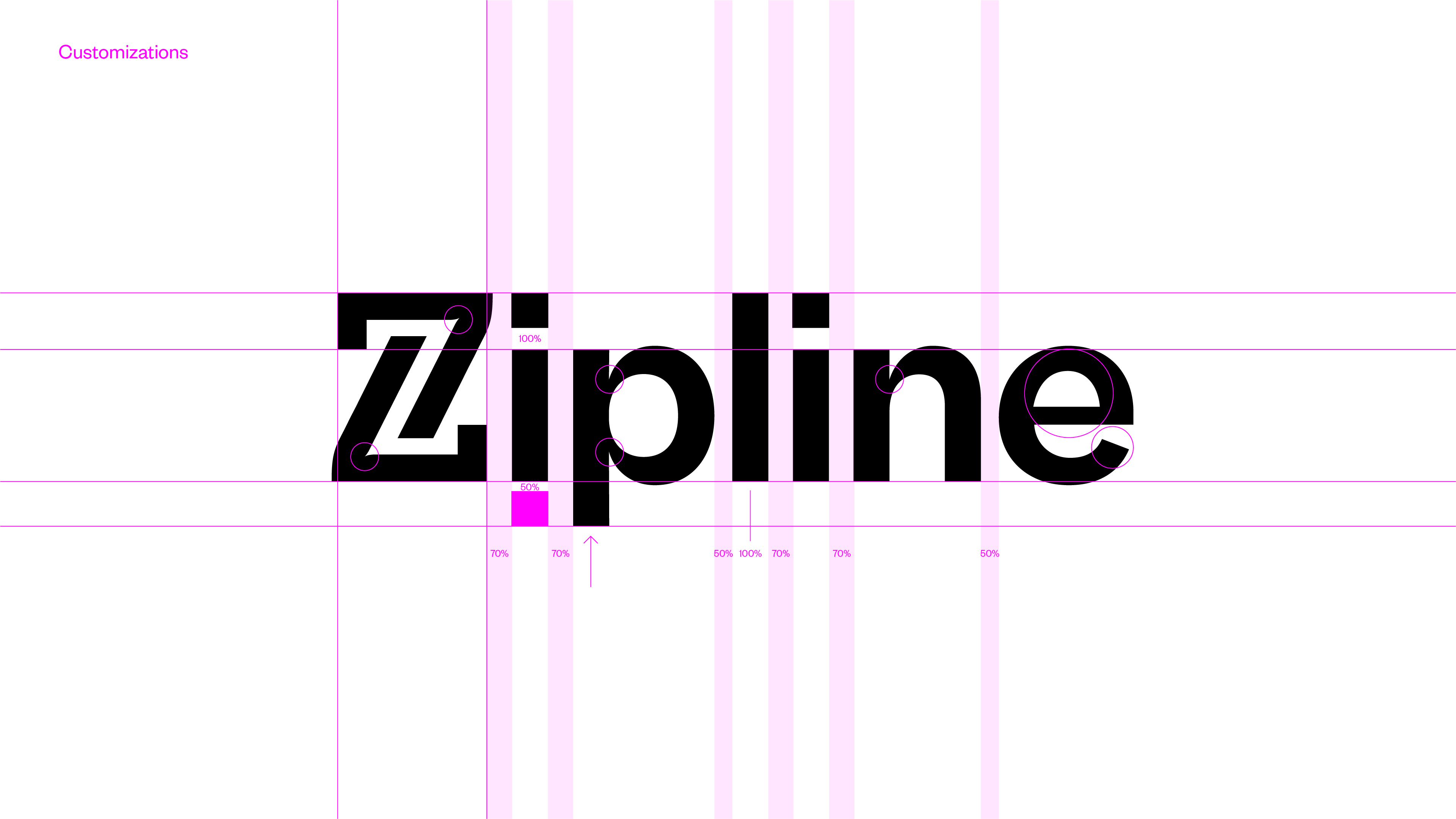
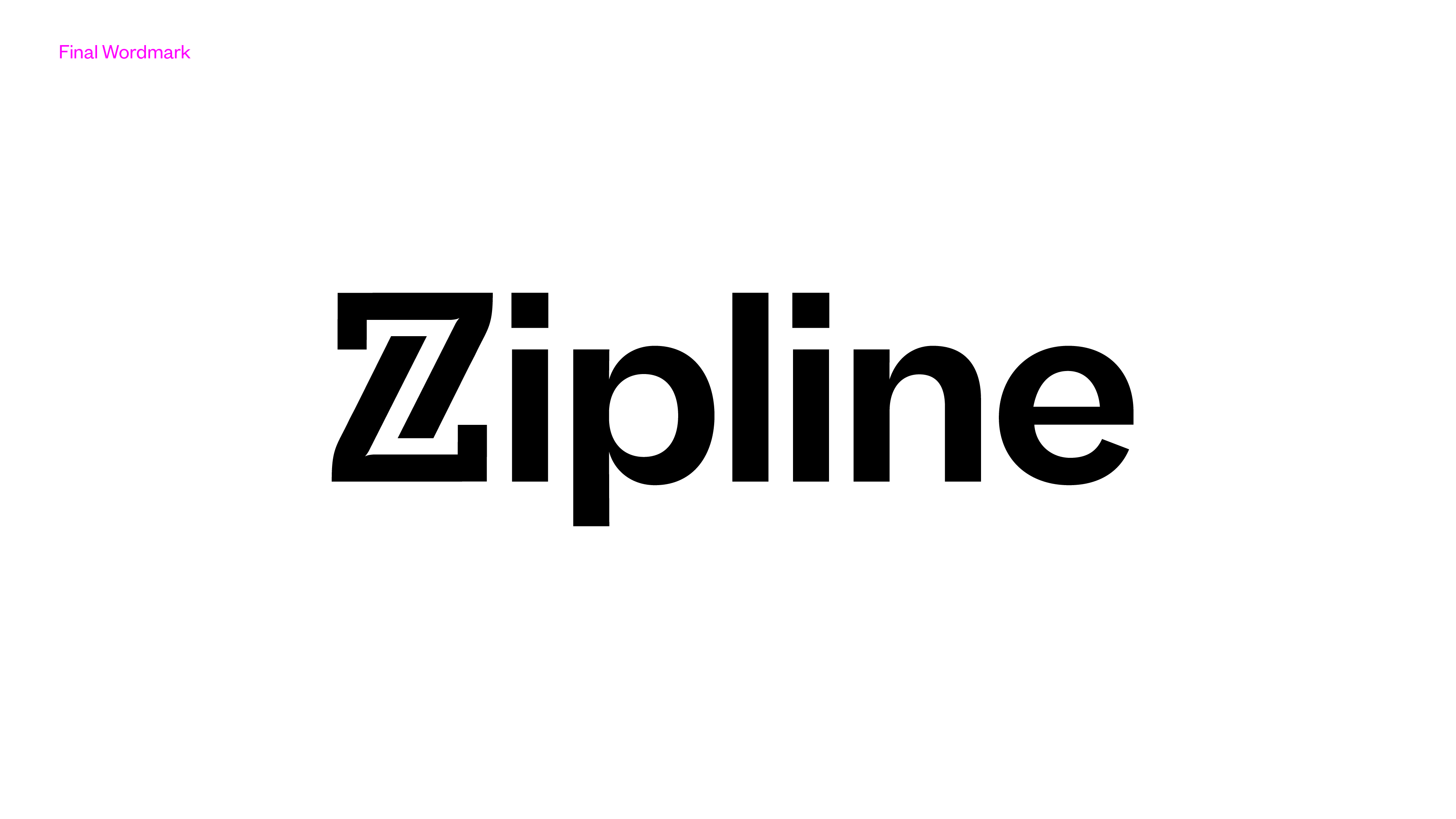
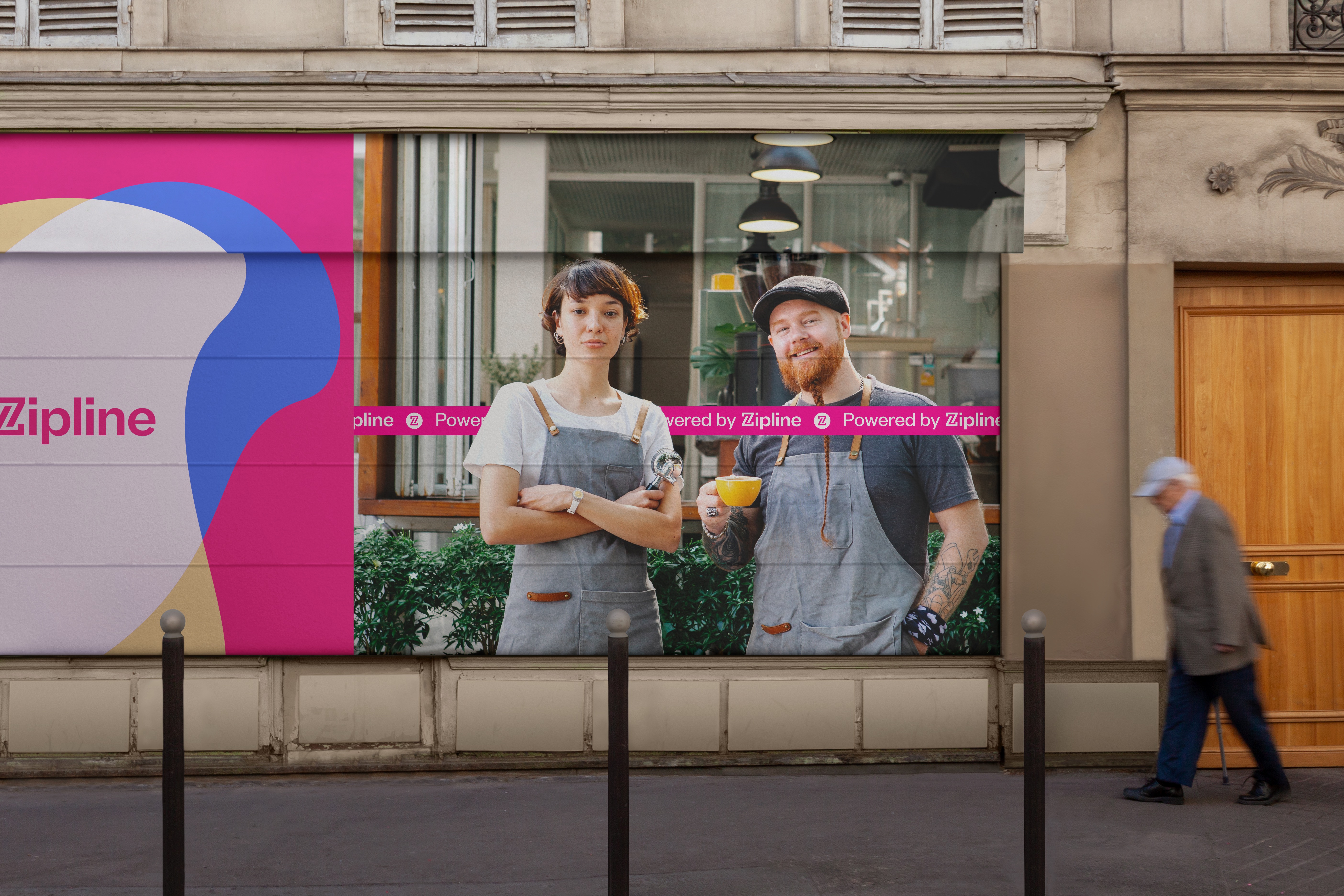
We redrew their “Z” symbol and created a new and improved wordmark that collapsed the symbol into a logotype built on a customized version of Founders Grotesk.
We redrew their “Z” symbol and created a new and improved wordmark that collapsed the symbol into a logotype built on a customized version of Founders Grotesk.


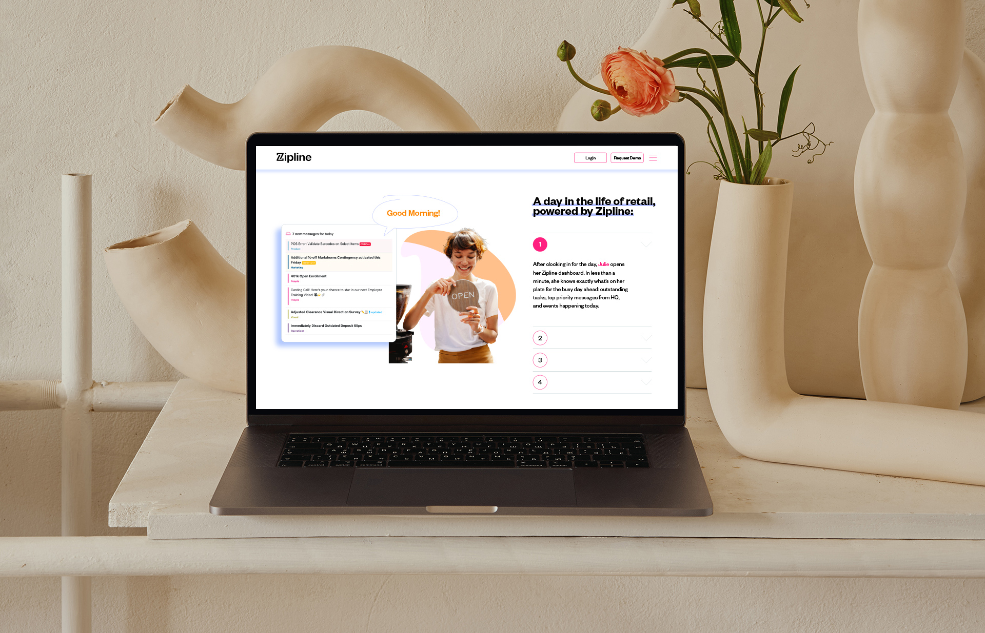
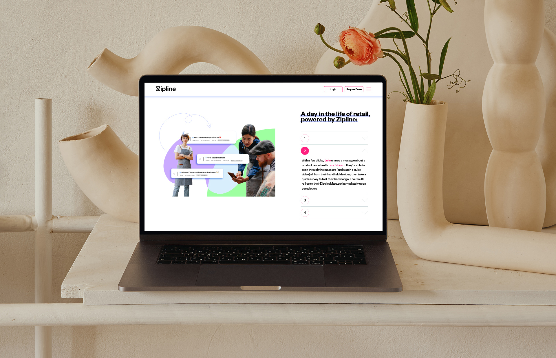
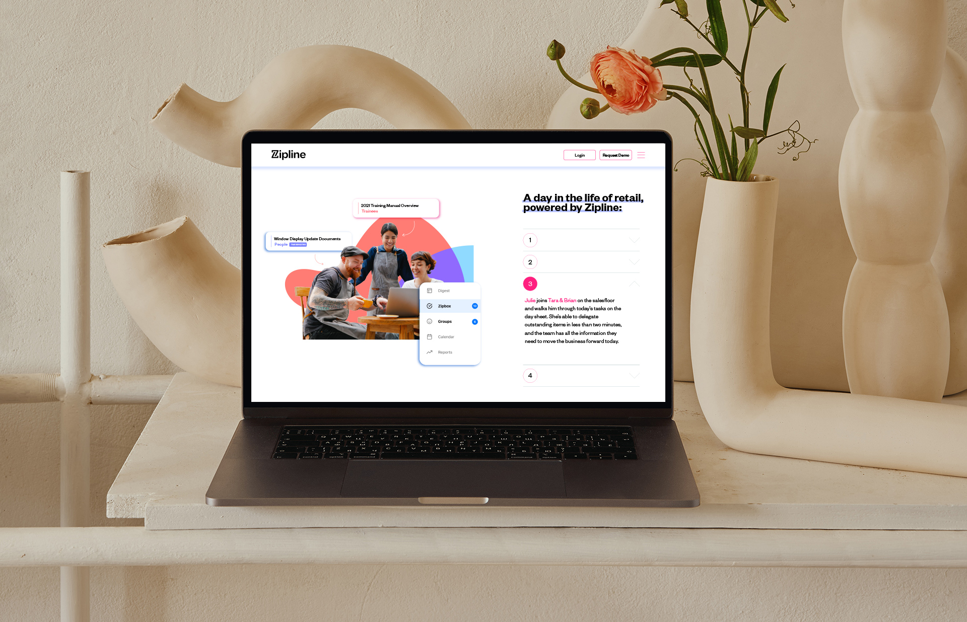
Zipline sits at the cross section of the “art and science” aspect of the retail world. Using this metaphor, we created a companion visual language that introduces a painterly graphic language which adds a much needed warmth to the brand—speaking to the human quality of the retail space.


Simplicity & Ease

Education
Better Understanding

Advocacy
GET IN TOUCH:
hello@sirensf.com